Before we explain more about this technique, first a disclaimer. This technique is not a new one, first written about back in 2013. We would also never implement this technique on a new site. In that case, the best solution we could give to our clients would be a complete mobile-first responsive build.
Responsive web design itself came about in 2010 and changed the web – and the way web developers think – forever. Before then and since the launch of iPhone, many opted to build mobile-specific versions of a website, which introduced a host of issues and frustrations to work through. RWD was great for those ready and with budget to build a new site. However, there were plenty that had invested heavily in fixed-width desktop sites, where this simply wasn’t an option. Here is where RWD Retrofit comes in.
RWD Retrofit allows an existing desktop site to co-exist with a responsive site, while also able to serve the desktop site to a different breakpoint on “mobile”. We have successfully implemented this for quite a few clients that had older desktop sites, with no mobile optimisation whatsoever. The solution provided a very cost effective means to make their sites mobile-friendly, particularly when they didn’t have the budget for a brand new fully responsive build. It is what we would call a compromise and does have a few downsides though, which we’ll explain later.
Why is RWD Retrofit a good compromise?
Having some form of mobile optimisation is definitely better than none. RWD Retrofit is a great stepping stone between a desktop-only site and a fully responsive rebuild. The benefits of using the solution are:
- You use your existing code base, making content updates more efficient
- A completely new stylesheet is used for mobile, so you’re not interfering with any of your existing desktop styles
- Very few changes to your existing website are needed
- Supports a wide variety of devices / screen sizes
- It’s relatively inexpensive to do – in some instances we have managed to implement in around 2 hours
As we mentioned, there are downsides, but you’d expect that with any compromise – that’s why it’s called a compromise! The existing site might not be flexible enough to be repurposed for mobile. Also, the largest responsive breakpoint may not look quite as good as when you get down to mobile screen sizes. The reality is, it’s probably only desktop user’s who resize their browser’s window that would see this though.
How does RWD Retrofit work?
It’s actually pretty straightforward. First we need to add a line of code to the existing site, that tells the browser how to control the page’s dimensions and scaling.
<meta name="viewport" content="width=device-width, initial-scale=1" />Then we need to change the link to the current stylesheet so it has a min-width media query:
<link href="/css/desktop.css" rel="stylesheet" media="all and (min-width: 900px)" />Then create a new responsive stylesheet and link to it with a max-width media query that is 1 pixel less than the desktop one, like this:
<link href="/css/rwd.css" rel="stylesheet" media="all and (max-width: 899px)" />Now you might think well, you still need to build the responsive stylesheet. True, but it’s not quite as daunting as it sounds. What we tend to do is copy the desktop stylesheet, replace any fixed widths with percentages and font sizes for ems rather than pixels, so that they can be scaled for different screen sizes. This is by no means done, but it gives you a starting point to test what happens at different screen sizes and make some further tweaks.
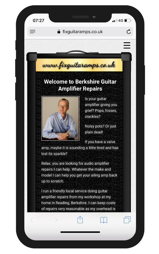
It’s highly likely the desktop navigation isn’t going to work on mobile, so we hide this and introduce a hamburger menu for the responsive version. There might be other content you have to treat in this way, but it all boils down to how the desktop site was build in the first place.
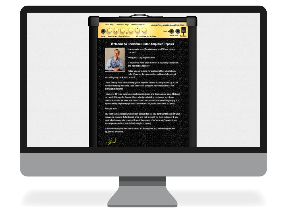
Here are a few examples where RWD Retrofit has been fit for our clients.


If you have an existing desktop site with no mobile optimisation and are interested in discussing RWD Retrofit for your site, contact us today.
We used a similar technique for WordPress sites. Read about WPtouch for WordPress for more information.